L'Alveare Miele
Premium food: artisanal Italian honey · Rebranding concept: visual identity and packaging
Italian honey reinterpreted with elegance: from the honeycomb to a complete label and packaging system.
Self-initiated exploratory project: no real client involved.
Context & objective
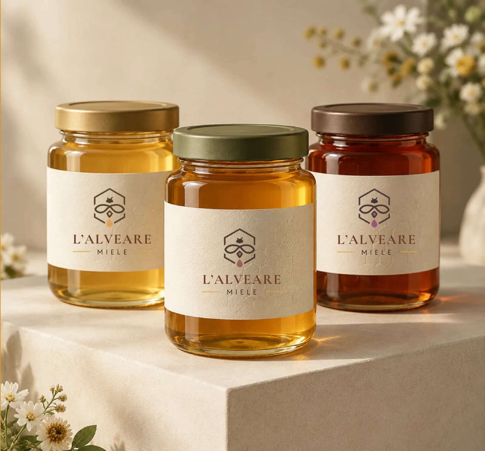
An AutentID demonstrative concept: a self-initiated exploratory project showing how a traditional product can be reinterpreted as premium and contemporary, without rustic clichés.
Turn a brand intuition into a complete, coherent, applicable visual system: symbol, palette, typefaces, labels and gift packaging.
The problem
Category packaging is often generic and unrefined: overused rustic labels, no information hierarchy, zero shelf recognisability.
Strategic approach
- Premium, natural, contemporary positioning: warm, essential, sophisticated, credible
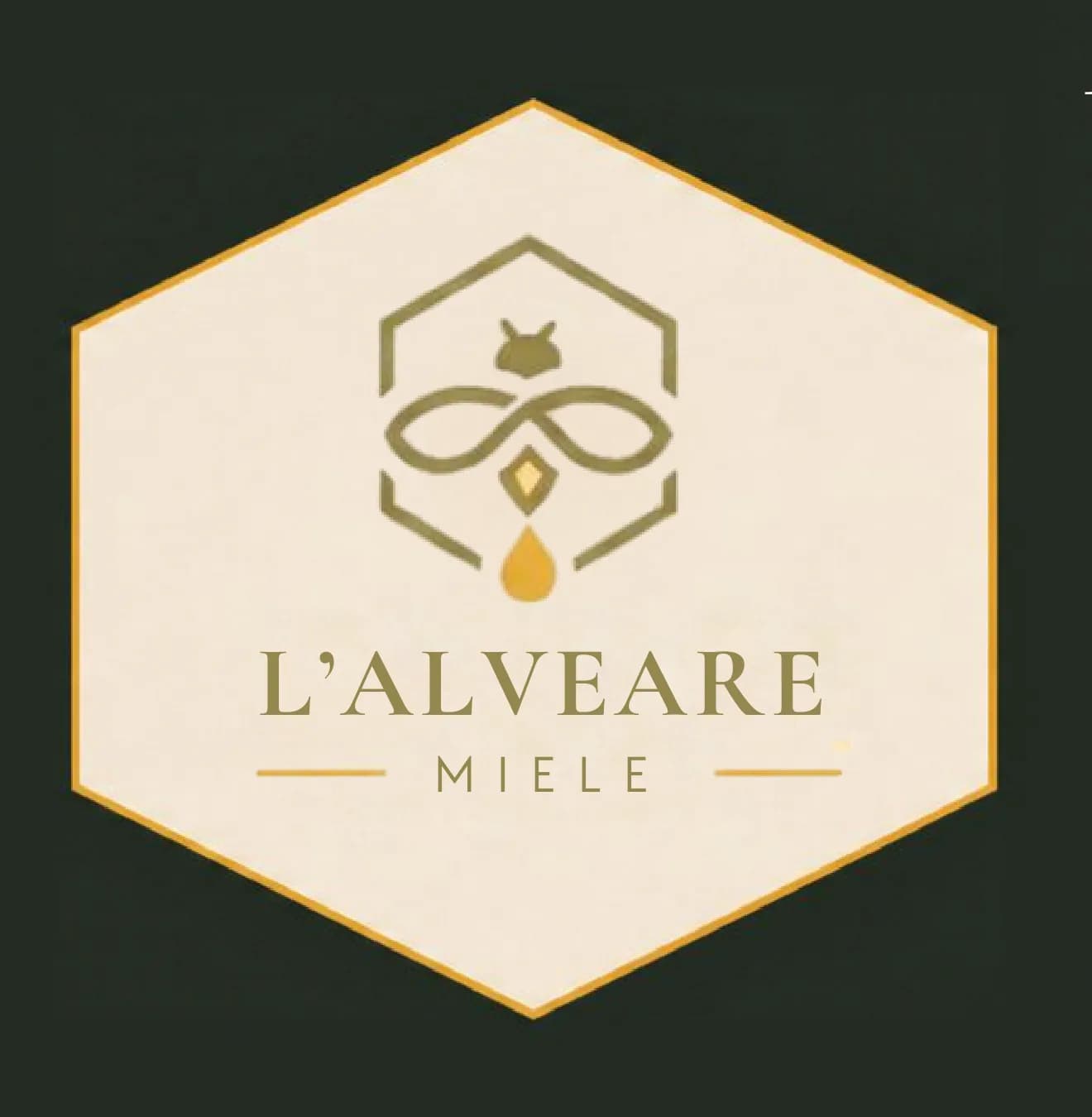
- The honeycomb hexagon reduced to a simple sign: frame and symbol at once
- A warm, essential palette: honey, cream, olive, black
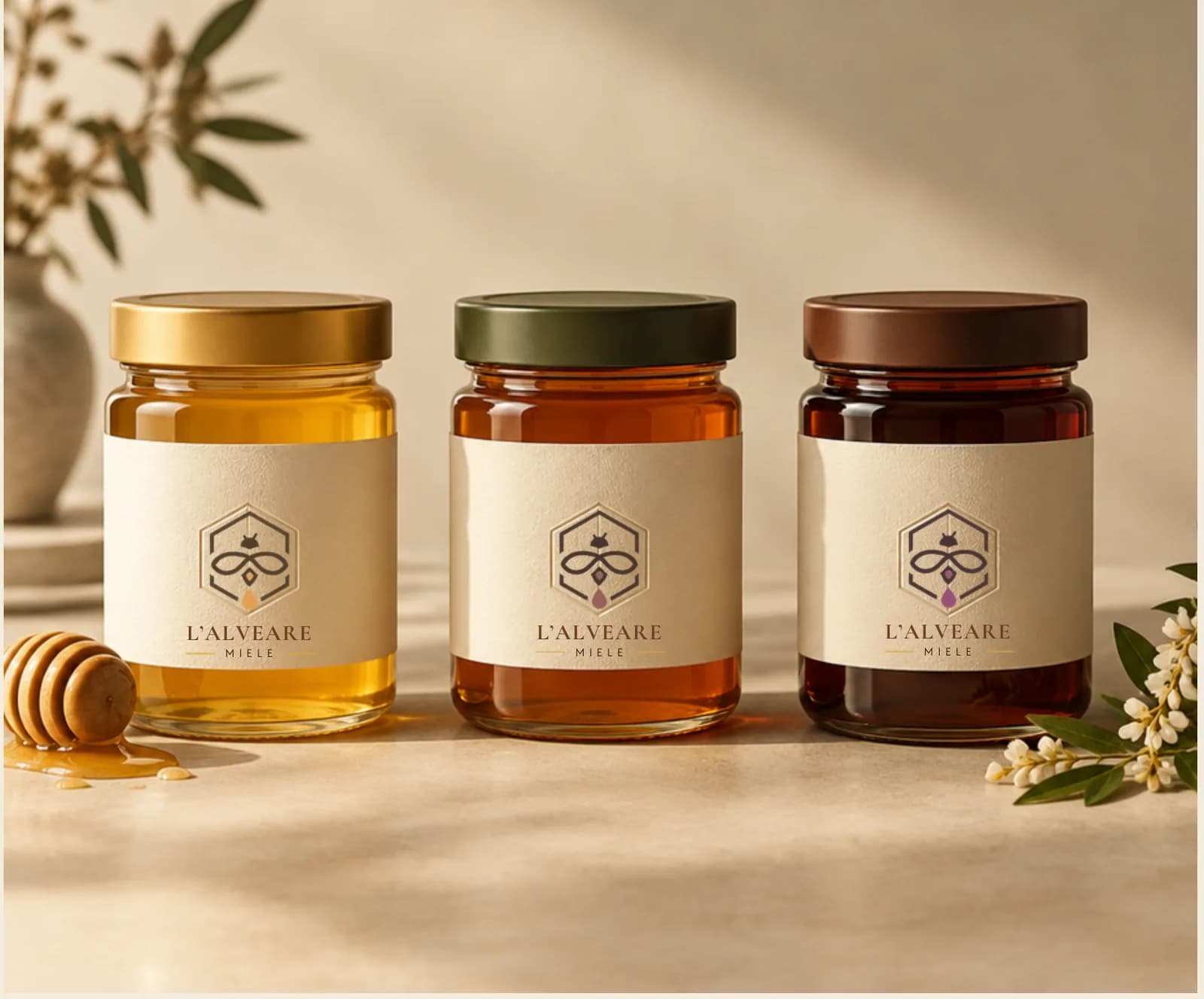
- One label grid, three chromatic personalities for three varieties
Solution & deliverables
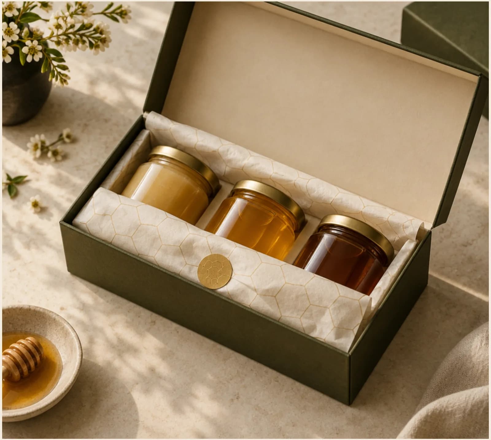
An editorial logotype in Cormorant Garamond with Manrope details, front and back labels with a rigorous hierarchy and no unverified claims, plus a rigid three-jar gift box that extends the system beyond the label.
- — Logo and hexagonal symbol
- — Colour and type system
- — Front and back labels (Millefiori, Acacia, Chestnut)
- — Coordinated gift packaging with tissue paper and hexagonal sticker
Related projects
Tell us about your project: within 24 hours you'll receive a first assessment, free and with no obligation.
The service behind this kind of work: Branding →