Pulizia Cappe Industriali
Industrial services: cleaning and restoration of extraction hoods · Rebranding and visual identity
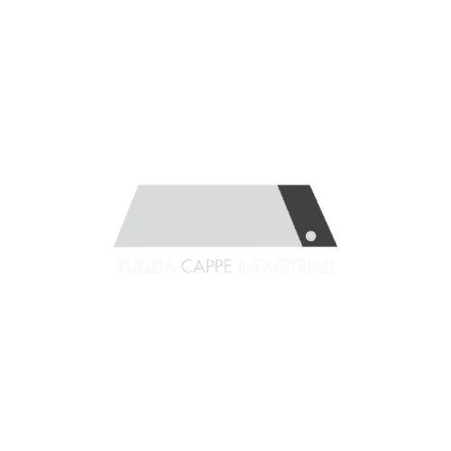
The logo finally looks like what it cleans: from generic blue to real steel.
Context & objective
The first version painted the hood in a "detergent blue": a colour that does not exist on the real object, because industrial hoods are stainless steel. The mark looked like a generic cleaning product, not a specialized technical service.
Anchor the brand to its real object: the symbol must communicate industrial competence, not a vague idea of "clean".
The problem
The colour disconnected the mark from the product: the blue confused it with detergents and generic services, weakening technical credibility with industrial kitchens and labs.
Strategic approach
- Start from the object: the hood as a recognizable geometric symbol
- Drop the "emotional" colour and adopt the material's own: steel
- Use the charcoal edge as contrast and as a nod to the exhaust duct
- Keep the shape clean and legible even at small sizes
Solution & deliverables
A steel-silver hood symbol with a charcoal side: the logo now is the product. Credible, technical, industrial, recognizable at any size.
- — Primary logo and variants
- — Steel/charcoal palette and usage rules
- — Applications on website and commercial materials
Related projects
Tell us about your project: within 24 hours you'll receive a first assessment, free and with no obligation.
The service behind this kind of work: Branding →